Can people explain why this brand, not merely what it sells?
Positioning gives the visual and verbal system a useful point of view to express.
A brand is the answer to one question: why you? We help you find that answer and turn it into a complete system: identity, voice, visuals, motion, packaging, guidelines and every touchpoint in between. Not a logo file in a folder. A living system your whole team can use.
Choose a discipline. See how strategy becomes language, identity, rules and recognisable real-world application.
Clarify who the brand is for, what it can credibly own and why the difference matters. Research becomes a focused positioning idea that can shape decisions beyond the launch deck.
Build language people can recognise before they see the logo. Naming directions are filtered for meaning, sound, fit and practical use; voice rules turn that choice into repeatable communication.
Turn the central idea into a flexible visual language: a responsive mark family, composition rules, graphic devices and enough range to feel alive without becoming inconsistent.
Assign every colour and type style a role. The result is not a decorative palette; it is a working hierarchy that remains legible, recognisable and useful across dark, light, print and digital surfaces.
Translate design decisions into clear rules, examples and templates. The guide explains what stays fixed, where expression is welcome and how the team can make new work without rebuilding the brand each time.
Define how the brand enters, responds, transitions and settles. Timing and easing support continuity and hierarchy so motion feels recognisable, not attached as decoration after the design is finished.
Pressure-test the identity where customers and teams will actually use it: interfaces, packaging, signage, presentations, social templates and the small recurring moments that build recognition.
We dig until we find the angle worth building on. Then we turn it into a name, a voice, and a visual system that travels from favicon to billboard without losing itself. Try it: click any colour below and watch the wordmark respond.
Most brands die in a Dropbox folder. Ours live in a system your team uses daily. Here's everything that comes with it.
Primary, stacked, monochrome, favicon, app icon. Every variation you'll ever need.
How the brand sounds across channels. Guidelines, not guesswork.
Display, body, mono families. Sized for screen and print.
Primary, accent, neutrals, dark and light themes. With hex, RGB and usage rules.
Easing curves, durations, reveals. How the brand moves on screen.
Business cards, packaging, signage, social templates, presentation decks.
The living document your team references. Do's, don'ts, examples, templates.
Social posts, email, decks, one-pagers. On-brand in minutes, not hours.
Custom icon set and illustration style unique to your brand.
The strongest identity systems carry one idea through language, typography, colour, composition and behaviour. Recognition grows when those decisions stay coherent across many different surfaces, not when every asset looks identical.
Positioning gives the visual and verbal system a useful point of view to express.
Voice, type, colour, image behaviour and motion should reinforce the same central idea.
Clear roles, examples and templates turn a launch asset into an operating system.
The identity is tested on the surfaces that can expose weak thinking: packaging, signage, reports, uniforms, interfaces and the small moments customers actually remember.
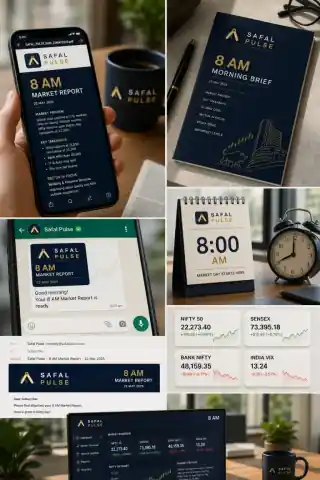
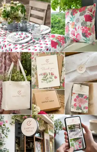
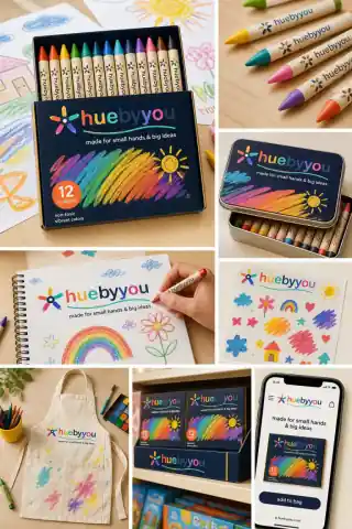
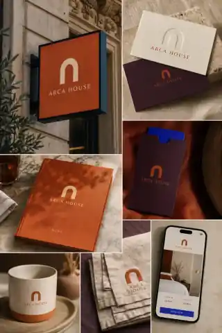

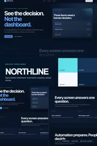
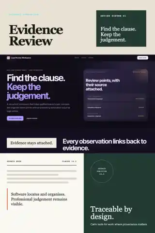
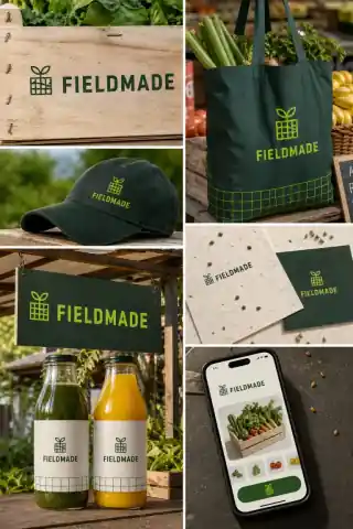
From corporate identity to personal brands, from content to social proof. Every branding-related service under one roof.
Logo suite, voice, colour, type, guidelines.
Founders, CEOs and leaders as brands. LinkedIn authority, thought leadership, speaking content.
Creative content across every channel. Strategy, production, community, paid social.
Blogs, newsletters, video, thought leadership. Content that ranks and compels.
Reviews, testimonials, community content. Your customers as your marketers.
Brand motion language, explainers, social motion graphics. How the brand moves.
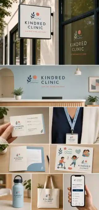
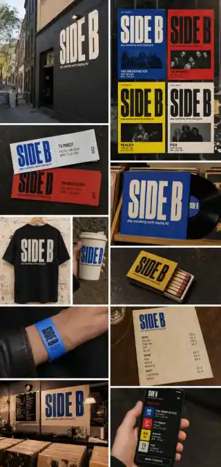
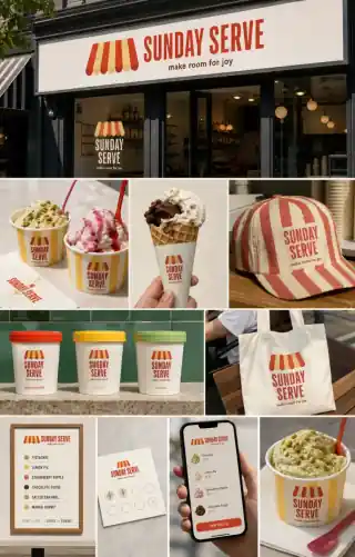
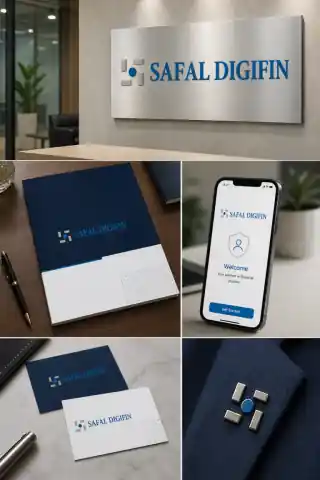
A brand isn't done when the logo is. It's done when it looks right on a business card, a billboard, an app icon and an Instagram story. We design for every surface your brand will touch: and give your team templates to keep it consistent.
Both. A full refresh of an existing brand is often the highest-leverage project. We respect what's working, fix what isn't, and build a system around it.
A full identity system typically takes four to eight weeks, depending on scope. We work in increments, so you see direction early and refine against your feedback.
Tell us what you stand for. We'll turn it into a system.